Nov 27, 2008
Sep 15, 2008
Nice table output for logistic regression analysis
R is good for logistic regression analysis through glm function, but results are not very nice for report. Here I provide function that we call reglog that is useful to show relevant data for the analysis of a categorical covariate.
reglog is called with a formula: reglog(y~x+z). You will get the analysis of variable x, adjusted for z respect to the binary response y. While x and y will be treated as factors if they are nor when suplied, covariates for adjustment can be numerical or factors. You can adjust for anything allowed in a glm formula, including interactions, but will not be shown. Interactions with x are not allowed. In a future post I will provide functions to study interactions.
Similar to glm, reglog accepts a data argument with a data.frame containing the variables. Missing values are excluded and a subset argument can be used to select observations for analysis.
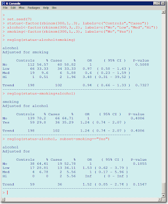
Sorry about the quality of this image. Blogspot doesn't allow better resolution and if I paste the text will not respect the spacing even if I use &nsbp;
Aug 19, 2008
Area under the ROC curve
The area under the ROC curve is a good measure of predictive accuracy for a binary event. Given a dataset with observed (0/1) and predicted values (probabilities), the function roc will calculate for a series of cutpoints the sensitivity, specificity, likelihood ratios and the area under the ROC curve. This function will also produce three plots.
data(Ionosphere)
model <- glm(Class ~ ., data=Ionosphere[,15:35], family=binomial)
roc(predict(model,type="response"), Ionosphere$Class=="good")
cp sens espe
[1,] 0.00 1.00000000 0.0000000
[2,] 0.05 1.00000000 0.2380952
[3,] 0.10 0.99555556 0.3412698
[4,] 0.15 0.99555556 0.3809524
[5,] 0.20 0.99555556 0.4206349
[6,] 0.25 0.99111111 0.4365079
[7,] 0.30 0.99111111 0.4603175
[8,] 0.35 0.98222222 0.5000000
[9,] 0.40 0.97777778 0.5317460
[10,] 0.45 0.97333333 0.5634921
[11,] 0.50 0.96444444 0.6111111
[12,] 0.55 0.94222222 0.6507937
[13,] 0.60 0.92000000 0.7301587
[14,] 0.65 0.85333333 0.7777778
[15,] 0.70 0.77333333 0.7936508
[16,] 0.75 0.69333333 0.8174603
[17,] 0.80 0.59555556 0.8412698
[18,] 0.85 0.40888889 0.8888889
[19,] 0.90 0.20000000 0.9285714
[20,] 0.95 0.01777778 0.9603175
[21,] 1.00 0.00000000 1.0000000
Jul 29, 2008
Confidence Intervals for glm and coxph models
Summary methods for linear and generalized linear models don't print nice confidence intervals. Use the intervals functions to get them easily. Following package nlme, intervals is generic and I have defined methods for glm and coxph. glm assumes a logistic regression model (family=binomial) an will show odds-ratios for covariates (not for the intercept).
fit<-glm(disease~gender, family=binomial)
intervals(fit)
or 95% C.I. P-val
genderMale 0.68 ( 0.57 - 0.81 ) 0.0000
fit<-coxph(Surv(time,status)~gender)
intervals(fit)
hr 95% C.I. P-val
genderMale 0.88 ( 0.55 - 1.42 ) 0.6061
fit<-glm(disease~gender, family=binomial)
intervals(fit)
or 95% C.I. P-val
genderMale 0.68 ( 0.57 - 0.81 ) 0.0000
fit<-coxph(Surv(time,status)~gender)
intervals(fit)
hr 95% C.I. P-val
genderMale 0.88 ( 0.55 - 1.42 ) 0.6061
Jul 7, 2008
How big are my R objects?
I took me some time to find the function that provides the memory an R object uses: object.size()
The function lsiz will show you the size of each object in an environment :
> lsiz(4)
Table 28584
qqpval 6052
The numbers show the object's size in bites.
The function lsiz will show you the size of each object in an environment :
> lsiz(4)
Table 28584
qqpval 6052
The numbers show the object's size in bites.
Observed and Expected p-values
You have tested hundreds or thousands of hypothesis in a microarray experiment or a large genotyping association study and need to know if you have more significant results than expected by chance alone.
Under the null, the distribution of p-values is uniform. You can plot the observed cumulative distribution of p-values against the expected under the null. The function qqpval will help you. I hope you get something better than that:
Jul 3, 2008
Simple tables with percentages
You can crosstabulate categorical data in R with table(), and get percentages with prop.table(). To get a combination of both, I programmed Table(), that provides this type of output:
> pets<-rep(c("cats","dogs"), 30)
> Table(pets)
pets (%)
cats 30 ( 50.0)
dogs 30 ( 50.0)
> size<-c("big","small")[sample(1:2,replace=TRUE, size=60 )] > Table(pets, size) # row percentages by default
size
pets big (%) small (%)
cats 13 ( 43.3) 17 ( 56.7)
dogs 19 ( 63.3) 11 ( 36.7)
> Table(pets, size, margin=2) # column percentages
size
pets big (%) small (%)
cats 13 ( 40.6) 17 ( 60.7)
dogs 19 ( 59.4) 11 ( 39.3)
> color<-c("black","brown","grey")[sample(1:3,replace=TRUE, size=60 )]
> Table(pets, size, color)
color = black
size
pets big (%) small (%)
cats 3 ( 33.3) 6 ( 66.7)
dogs 3 ( 75.0) 1 ( 25.0)
color = brown
size
pets big (%) small (%)
cats 6 ( 54.5) 5 ( 45.5)
dogs 6 ( 54.5) 5 ( 45.5)
color = grey
size
pets big (%) small (%)
cats 4 ( 40.0) 6 ( 60.0)
dogs 10 ( 66.7) 5 ( 33.3)
Only up to 3 dimensions, but these should be enough most of the cases.
You can download the code from here
I usually keep useful functions in an RData that I attach automatically in my Rprofile.
Subscribe to:
Posts (Atom)